My previous post showed a three colour composite of showing image (or an aspect layer), elevation and slope, but I think that can be difficult to interpret, becasue a steep slope would either be blue, cyan, or magenta or white depending on what else is in the other layers.
So I'll be doing pseudocolour like this, using an image layer underlaid using transparency. I'm using meters in an Equicylindrical projection with 40 degrees latitude parallel. I think its nice to have metres as units for figures of individual objects/tiles, but maybe lat/long would work better for larger summary plots?
Elevation - overview east of Hellas
This is one of the areas I'm focusing analysis of the results for the dissertation. There are two tiles with 50m HRSC topography, and other tiles available at 75m, including the well-studied Crater Greg.
Elevation

Slope
I'm using a single colour ramp for slope at the moment, I think this is probably clearer than a spectral pattern.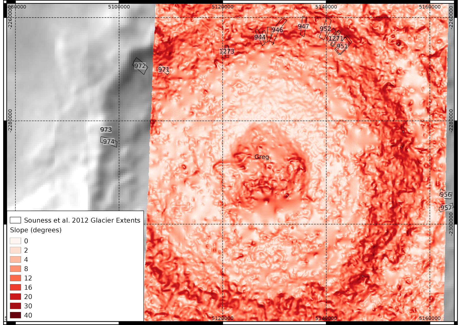
Curvature layers
I wasn't sure which colour scheme to do this in, given they can be both positive and negative, but purple/green seems to be alright, as long as its clear which is positive.

No comments:
Post a Comment