Showing posts with label data visualisation. Show all posts

Saturday, 10 June 2017

General Election 2017 - and trying out the Python pandas library

I am happy to report that my computer is working again, after a reformat, Windows 7 installation, then a long delay while Ubuntu partition resizer stalled, then fixed that with a GParted iso, and then reinstalled Ubuntu 17.04 and I am part way through restoring data from backups.
QGIS is working with version 2.18.

Although I have used Python csv, matplotlib and numpy libraries to read data from files and plot I hadn't used the pandas library for anything much, so I thought I'd do so. I have in previous code often built up a list manually by setting data = [] and then using append to build up the list, which can be slow for large datasets.

First I need some data, and I will use the general election results for the 6 parliamentary constituencies for the House of Commons in Cornwall:


Constituency,Surname,Forenames,Description,Votes,Turnout
Camborne and Redruth,EUSTICE,Charles George,Conservative Party,23001,70.96
Camborne and Redruth,WINTER,Graham Robert,Labour Party,21424,70.96
Camborne and Redruth,WILLIAMS,Geoffrey,Liberal Democrats,2979,70.96
Camborne and Redruth,GARBETT,Geoffrey George,Green Party,1052,70.96
North Cornwall,MANN,Scott Leslie,Conservative Party,25835,74.2
North Cornwall,ROGERSON,Daniel John,Liberal Democrats,18635,74.2
North Cornwall,BASSETT,Joy,Labour Party,6151,74.2
North Cornwall,ALLMAN,John William,Christian Peoples Alliance,185,74.2
North Cornwall,HAWKINS,Robert James,Socialist Labour Party,138,74.2
South East Cornwall,MURRAY,Sheryll,Conservative Party,29493,74.2
South East Cornwall,DERRICK,Gareth Gwyn James,Labour Party,12050,74.2
South East Cornwall,HUTTY,Philip Andrew,Liberal Democrats,10346,74.2
South East Cornwall,CORNEY,Martin Charles Stewart,Green Party,1335,74.2
St Austell and Newquay,DOUBLE,Stephen Daniel,Conservative Party,26856,69.3
St Austell and Newquay,NEIL,Kevin Michael,Labour Party,15714,69.3
St Austell and Newquay,GILBERT ,Stephen David John ,Liberal Democrats,11642,69.3
St Ives,THOMAS,Derek,Conservative Party,22120,76.1
St Ives,GEORGE,Andrew Henry,Liberal Democrats,21808,76.1
St Ives,DREW,Christopher John,Labour Party,7298,76.1
Truro and Falmouth,NEWTON,Sarah Louise,Conservative Party,25123,75.9
Truro and Falmouth,KIRKHAM,Jayne Susannah,Labour Party,21331,75.9
Truro and Falmouth,NOLAN,Robert Anthony,Liberal Democrat,8465,75.9
Truro and Falmouth,ODGERS,Duncan Charles,UK Independence Party,897,75.9
Truro and Falmouth,PENNINGTON,Amanda Alice,Green Party,831,75.9

Here is the Python code, which expects the above data in a file called electionresults2017.csv which it reads using csv.DictReader which produces an iterator which I convert to a list and create a pandas data frame object.
The code is also available in the dataviz-sandbox repository at my Bitbucket account.


import matplotlib.pyplot as plt
import pandas as pd
import numpy as np
import csv

def chooseColour(desc):
    if desc == "Labour Party":
        return "red"
    elif "Liberal" in desc:
        return "yellow"
    elif "Green" in desc:
        return "green"
    elif "Conservative" in desc:
        return "blue"
    else:
        return "magenta"
    
with open('electionresults2017.csv', 'r') as spamreader:
    dframe = pd.DataFrame(list(csv.DictReader(spamreader)))

consts = set(dframe['Constituency'])
print(consts)
fig = plt.figure()
plt.suptitle("Distribution of Votes in Cornwall\nGeneral Election 8th June 2017")
plt.axis('equal')
plt.xticks([])
plt.yticks([])
for p, c in enumerate(consts):
    # print("Constituency of {}".format(c))
    surnames = dframe.loc[dframe.Constituency == c, ['Surname']].values
    forenames = dframe.loc[dframe.Constituency == c, ['Forenames']].values
    descs = [d[0] for d in dframe.loc[dframe.Constituency == c, ['Description']].values]
    plotcolours = [chooseColour(d) for d in descs]
    forenames = [f for f in forenames]
    forename = [f[0].split()[0] for f in forenames]
    names = [f+" "+s for f,s in zip(forename, surnames)]
    names = [n[0] for n in names]
    votes = dframe.loc[dframe.Constituency == c, ['Votes']].values
    votes1 = [v[0] for v in votes]
    namedescsvotes = [n+"\n"+d+"\n"+v for n,d,v in zip(names, descs, votes1)]

    totalvotes = np.sum(votes, dtype=np.int)
    # print(totalvotes)
    ax = fig.add_subplot(2, 3, p+1)
    ax.axis('equal')
    ax.set_title("{C}: {t} votes cast".format(C=c, t=totalvotes))
    ax.set_xticks([])
    ax.set_yticks([])
    ax.pie(votes, radius = np.sqrt(totalvotes/50000.0), labels=namedescsvotes, colors=plotcolours, autopct='%1.1f%%')

                          
fig2 = plt.figure()
plt.suptitle("Representation of Cornwall in the House of Commons")
plt.axis('equal')
plt.xticks([])
plt.yticks([])
for p, c in enumerate(consts):
    descs = dframe.loc[dframe.Constituency == c, ['Description']].values
    descs = descs[0]
    plotcolours = [chooseColour(d) for d in descs]
    print(descs)
    ax = fig2.add_subplot(2, 3, p+1)
    ax.axis('equal')
    ax.set_title(c)
    ax.set_xticks([])
    ax.set_yticks([])
    ax.pie([1], labels=descs, colors=plotcolours)

plt.show()

And the results:

The votes cast for the various candidates and parties in each of the 6 constituencies covering Cornwall and the Isles of Scilly. George Eustice MP uses his middle name rather than his first name Charles.
In comparison to votes cast, here are the parties represented in the House of Commons for constituencies in Cornwall.

I have also tried out matplotlib_venn. It takes as arguments the keyword subsets, which for the function venn2 expects A and (not B), (not A) and B, and (A and B). Below, voteothers is the number who voted for non-elected candidates, the second is by definition an empty set (those who didn't vote and cast a vote for the winner), and votewinner is those who voted for the winner.

Since Cornwall is a one-party state, the colours can be hard-coded.

import matplotlib.pyplot as plt
import matplotlib_venn as venn
...
    # subsets = (Ab, aB, AB)
    v = venn.venn2(subsets=(voteothers, 0, votewinner), set_colors =('lightgray', 'navy'), set_labels=('Other candidates', winnername))
...


The function venn3 expects a 7 element tuple as below. In this case, A is the electorate, B is those who voted for the winner, and C is those who voted for other candidates.

import matplotlib.pyplot as plt
import matplotlib_venn as venn
...
    # subsets=(Abc, aBc, ABc, abC, AbC, aBC, ABC)
    v = venn.venn3(subsets=(novote, 0, votewinner, 0, voteothers, 0, 0), set_colors =('lightgray', 'blue', 'red'), set_labels=('electoral register', winnername,'Other candidates'))
...

It would be nice to make the zero sets disappear, maybe there is a way to do this in the documentation somewhere.

Sunday, 22 January 2017

Data visualization of Aberystwyth Shipping Records

In a previous post, I described the shipping records for vessels registered at the port of Aberystwyth, transcribed by volunteers and released in digital form by the National Library of Wales.

I have used openpyxl to read the files (released as Excel spreadsheets) in Python. I have uploaded the code at bitbucket.org/davidtreth/aberystwythships (the data itself should be downloaded from the National Library of Wales site).

I have uploaded results at taklowkernewek.neocities.org/abership and have recently extended this to include plots made using matplotlib, which are presented below (and will be put up in some form at the neocities page soon).

The earliest and latest dates recorded for each vessel.

The joining and leaving dates for every mariner recorded (who has parsable dates)

An example vessel.

Another example vessel

Another example vessel


Saturday, 19 December 2015

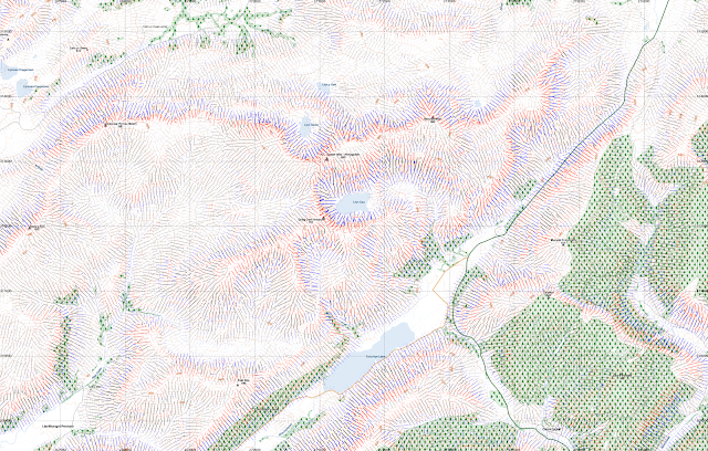
Slope lines from segmented digital elevation model - after upgrade to QGIS 2.12.1

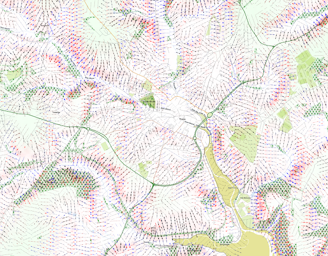
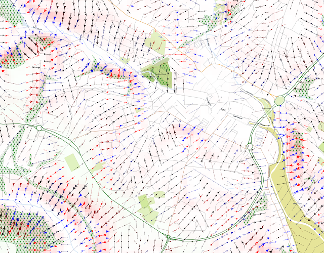
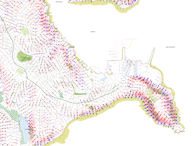
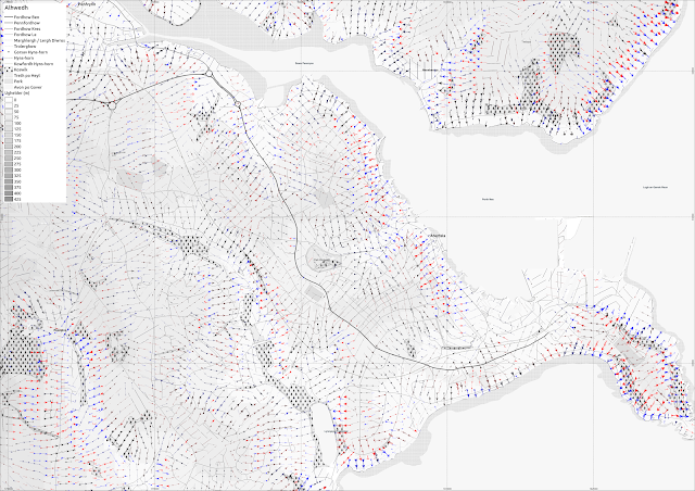
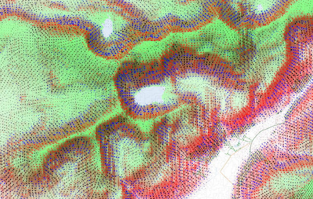
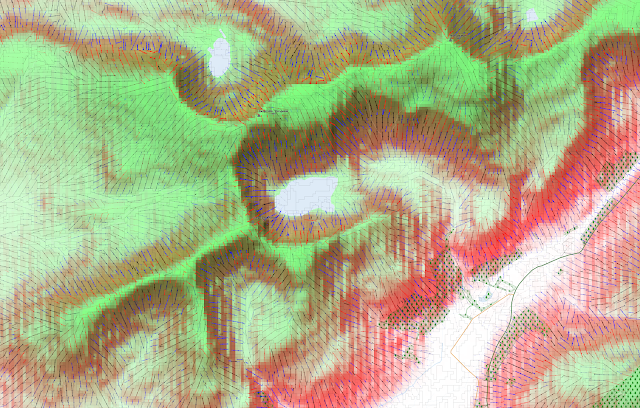
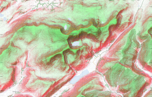
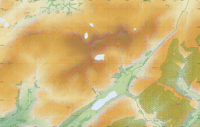
I mentioned previously that I used QGIS to draw lines in the direction of slope, where I had a segmented layerstack which included elevation, slope, aspect and 2 curvature layers (longitudinal and cross-sectional). This was done with RSGISlib in a similar way to my Mars work.

There was an bug with QGIS 2.12 that meant the plotting of arrows didn't work but with QGIS 2.12.1 this seems to be working again. It still takes a long time to render with the SVG marker, even with 32GB RAM and a quad-core system.

Here are a few examples:

Truro area in Cornwall. The slopes are marked with arrowed lines, with steeper slopes marked more thickly, and red for convex, and blue for concave slopes.

A closer zoom into the city.
Around Falmouth, including Pendennis Head
Falmouth again, with grayscale elevation.

Aberystwyth, Ceredigion, Wales:

I show here several QGIS screenshots, at 1:10000 or larger scale, since the rendering of the arrows becomes very slow beyond 1:10000.


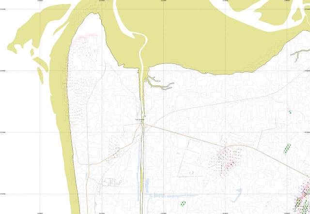
Ynys Las and part of Borth Bog (Cors Fochno). This is mainly a flat area so most segments do not have lines shown.
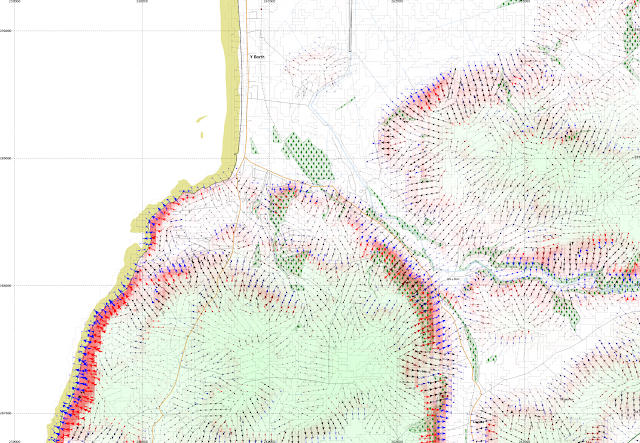
Borth itself, a little to the south
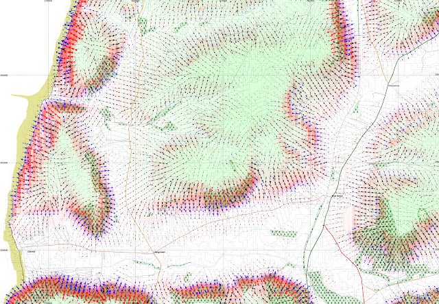
Clarach Bay, and Wallog, and Bow Street

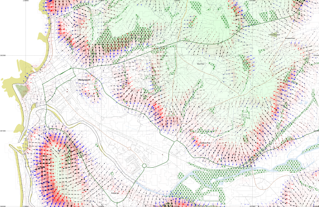
Aberystwyth town and main university campus are here shown, along with Pendinas hillfort, Penparcau, and Llanbadarn Fawr.

Cadair Idris - a textbook glacial landscape

Showing the arrows downslope only.

Adding in the slope parallell lines but making the arrowheads smaller.

At 1:20000 this takes a long time to render on the map canvas in QGIS.
A version with only the lines renders much faster.

Using contours instead of shading to indicate elevation.

Thursday, 18 September 2014

Cartographic decisions for dissertation

So now I've (almost) finished writing my dissertation, I'm putting in the various figures. I'm mainly using QGIS for this, most of the time the map composition feels more intuitive than ArcMap.

My previous post showed a three colour composite of showing image (or an aspect layer), elevation and slope, but I think that can be difficult to interpret, becasue a steep slope would either be blue, cyan, or magenta or white depending on what else is in the other layers.

So I'll be doing pseudocolour like this, using an image layer underlaid using transparency. I'm using meters in an Equicylindrical projection with 40 degrees latitude parallel. I think its nice to have metres as units for figures of individual objects/tiles, but maybe lat/long would work better for larger summary plots?

Elevation - overview east of Hellas

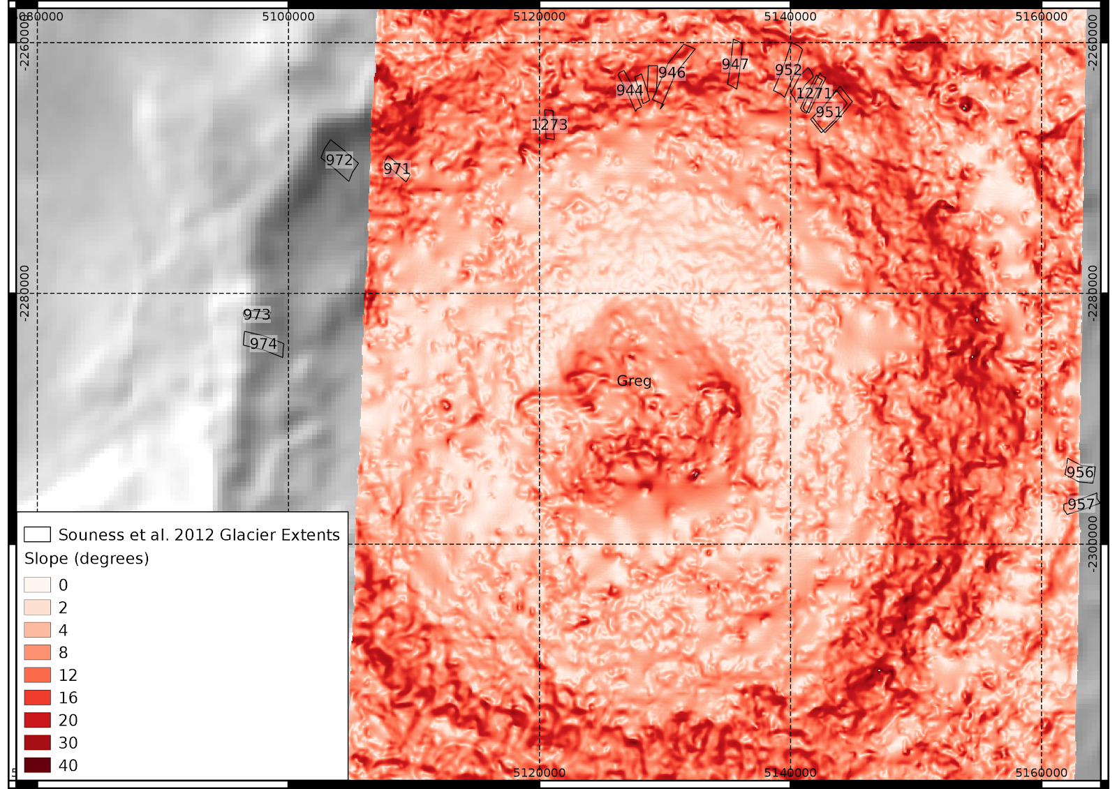
This is one of the areas I'm focusing analysis of the results for the dissertation. There are two tiles with 50m HRSC topography, and other tiles available at 75m, including the well-studied Crater Greg.

 Elevation

 Slope

I'm using a single colour ramp for slope at the moment, I think this is probably clearer than a spectral pattern.

Curvature layers

I wasn't sure which colour scheme to do this in, given they can be both positive and negative, but purple/green seems to be alright, as long as its clear which is positive.


Wednesday, 9 July 2014

Cornish identity in the 2011 census

Here is a dot map representing all people in Cornwall declaring Cornish national identity in the 2011 census, generated using random points clipping the census output areas to the OS OpenData buildings layer.


As a heatmap, classifying by powers of 2:

Tuesday, 8 July 2014

Speakers of the Welsh language according to 2011 census.

Much was written about a relatively small drop in the percentage of Welsh speakers in Wales as recorded by the 2011 census. I'm sure an astronomer wouldn't believe it was anything other than statistical noise if her data showed a 1% change from one survey to another....

Nevertheless, it is possible to visualise the data in a different way to the standard colorised maps you often see about these things.

One way is the restriction of the census output polygons to where buildings exist as the Datashine project did. However their website does not display statistics for Welsh language skills, since the detailed question was not asked to census respondents living outside Wales.

How about we use a QGIS plugin to give each Welsh speaker in Wales (or actually here, anyone claiming any skill in Welsh) a circular piece of land 50 metres wide, randomly located somewhere below 300 metres above sea level in his output census area polygon:


So here we have the opposite problem to the issues with the typical visualisations with colourised choropleth maps where large but sparsely populated areas dominate visually,namely that denser areas are oversaturated at this scale.

It is also possible to take this random dot distribution and make it into a heatmap (click on the image for a larger version):

I also downloaded the OS OpenData buildings layer for the relevent grid squares covering Wales, and produced another dots distribution (this took QGIS some time).

This produces the following dot maps, giving each Welsh speaker 50 metre and 20 metre diameter circles of land respectively:

Heatmaps: